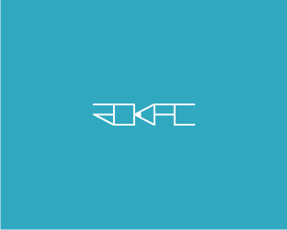
Rhinopotamus
by Rokac • Uploaded: Nov. 11 '10

Float
(Floaters:
14 )
Description:
Logo for a photographer. Client wanted fun but professional approach.
Updated.
As seen on:
--
Status:
Client work
Viewed:
5059
Share:
Lets Discuss
well, you actually achieved both. The fun part is portrayed in the style of the illustration, while the corporate aspect is portrayed in the neat typeface. but a sanserif option might strengthen the corporate look n feel. IMO
ReplyThanks for your thoughts mavric. You mean serif option? Because sanserif is already applied:)
Replythis is fun. :)
ReplyYou mean fun and professional:-) *Thanks Mikey:)
ReplyI agree with Mavric! Really great work my friend. :)
Reply%5EThanks Ali:)
ReplyAnd the frightened people will say: %22Wheeere, where%22? :)*Thanks Alen.
ReplyUpdated and accepted. Client very satisfied:)
ReplyThanks Alen!*What a great project this was. Fantastic client, great collaboration. Did some biz card design also:)
ReplyPlease login/signup to make a comment, registration is easy