Mutant Melon
by MrMurray • Uploaded: Oct. 18 '10

Description:
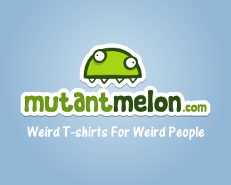
A logo for a small t-shirt design label. Designed to subtly suggest a graffiti sticker.
As seen on:
Mutant Melon
Status:
Client work
Viewed:
3399
Share:
Lets Discuss
very charming, especially the mark.
ReplyI like that creature.
Replyhaha! I have to say I'm kinda in love with that monster mutant melon thing!
Reply:))))
ReplyThis logo ruins the quality of the front page I'm sorry to say.
ReplyI completely agree with Sean here.*Another proof that there's no logic and honest system behind being worth featured in lp's gallery.*
Reply%22Another proof that there's no logic and honest system behind being worth featured in lp's gallery.%22**I added this to the gallery because it appealed to me. Certainly nothing %22dishonest%22 or %22illogical%22 about that... is there?... perhaps you are confusing logo designing with something else altogether :)
Reply@nido I understand and I certainly wouldn't argue about taste.**It's just that I felt the same as what sean wrote here.**I always thought there was some kind of public rating involved for being featured in the gallery. Guess I was wrong all the time :)
ReplyI like it, it's fun, creative and nicely done. I see weaker logos with many imperfections in the gallery on a regular basis, but it's all subjective.
ReplyLol, at 2nd thought I think you're right. It's a fun logo indeed. It really stands out on the current frontpage for sure!
ReplyWay to go Nav! you Mutant Logo designer.
Reply%3C3 it*
Reply%5E fits the site though ?
ReplyI think its target nicely to its market.
Reply%5E*%5E LOL
ReplyThis logo doesnt ruin the home page, but the mean comments im reading here are what would turn me off from this site. Are some of you seriously that mean? This designer just submitted a logo, it got put on the home page and now they have to read this garbage? Put your craft in perspective. this is a subjective industry in case you haven't noticed by now. Not everything has to look like it was carved out of marble and designed to go on 2000 dollar letterpress business cards.
ReplyI'm surprised that this logo got onto the gallery, but in a good way. I think the logo suits the style of the t-shirts illos being sold on the site. A good logo must represent the client behind it. Thus, it's a successful logo. Although I would use a different font for the tagline (subjective opinion).
Replywhy was it removed?
ReplyI thought the %22subjective/objective%22 views on this was one of the reasons it had such appeal. **Anyhow, nice work MrMurray.. any one of those Mutants on those T's would have made a fun logo.
Reply@logomotive... lol, thanks Prof. X %3B)
ReplyPlease login/signup to make a comment, registration is easy