Low Cost Construction
by InkwillDesign • Uploaded: Oct. 05 '10
Description:
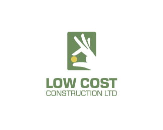
May I have your opinions on this, please? Trying to be clear but not boringly obvious. Thanks.
Status:
Client work
Viewed:
12509
Share:


Lets Discuss
I see a house in the negative space and a hand holding a coin.
ReplyGreat concept William, welcome back with new way! :)
ReplyI'm digging this concept, cool Wiliam.
ReplyI like this - nice concept and execution. Just an idea - if you flipped the mark horizontally you'll kinda have the fingers forming a L and a C. The type is a bit over powering the mark at the moment imo.
ReplyThank you, guys, for all your feedback. I'll work on your suggestions regarding the typeface size/strength. Anyway, my concern was the concept but I'm happy everyone spots the house (designers and non-designers), it was worrying me. Also this morning I received word from my client that this concept widely exceeded his expectations :)
ReplyThe first thing it reminded me of was unfortunately the famous painting of Gabrielle dEstree and her sister:*http://www.puc-rio.br/louvre/images/ipestree.jpg
ReplyHopefully no one else will think that!
Replygreat :o)
ReplyThank you, Hossein!
Replynice!!I can read a house stand for construction,but could you please expian where represents the low cost in your work%uFF0Cno offense,I'm fledgling :)
ReplyPlease login/signup to make a comment, registration is easy