ADAPTIC rev 2.2
by azao • Uploaded: Sep. 15 '10

Float
(Floaters:
3 )
Description:
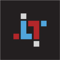
Another approach on IT consulting and web designing company's logo. 3 visible, quasi 3D cubes correspond to 3 main values that company has to offer to its clients - propper, adapted technology, knowledge and reliability. The group of cubes' individual parts in the middle forms a new sunflower-like shape. It represents a customed service which comapny designs and serves for a given client. Other cubes' parts stand for company's areas of expertise which client doesn't need actually, but they are still available on its demand.
Status:
Work in progress
Viewed:
6814
Share:
Lets Discuss
The concept comes so naturally that I wonder if someone hasn't developed something similar. Please let me know if you have seen anything close. *Up to now I've found such logos:*%22soundbar%22:http://logopond.com/gallery/detail/75617 (quite close, but still)*%22Ultimate Phonics%22:http://logopond.com/gallery/detail/68619*%22Create%22:http://logopond.com/gallery/detail/102525*%22solarri%22:http://www.solarri.com/
ReplyThis is a really nice mark. It's so clean, crisp, clear and simple. The bonus for the client is that it can appear in literally any color of the rainbow. My only suggestion is that you play with centering the text and trying various alignments of text and visual.
ReplyThank you @sunshineflowerbunny, I will.
ReplyPlease login/signup to make a comment, registration is easy