cobode
by VERG • Uploaded: Aug. 30 '10 - Gallerized: Nov. '10
Description:
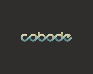
For an architect that designs modern co-living houses. Original version here
also published on behance
As seen on:
http://www.vergadvertising.com
Status:
Nothing set
Viewed:
22378
Share:
Lets Discuss
LOVE the logo design - but not a fan of the colors. I think it would look better blending from a light green (at the top) to a darker green (at the bottom). But I'm assuming the green to brown blend was probably client driven. Nice logo regardless.
Replythanks sdijock, here's your suggestion. i've looked at this too long now and can't work out what's best. i still like the original brown to blue %5Bi think%5D.
ReplyGood flow.
Replylove the colors
Replythis is pretty nice, great flow. I like these colors better.
ReplyThanks Alex %26 Wende... the client in the end went for a simple grey scale version that you can see %3CA href%3D%22http://www.cobode.com.au%22%3Ehere%3C/a%3E
Replyhttp://www.cobode.com.au
ReplyThanks Alex %26 Wende... the client in the end went for a simple grey scale version that you can see here http://www.cobode.com.au
Replywoops!
ReplyI've seen this technique used on quite a few logos with lowercase letters, but this one being so long and working for client is impressive.Very balanced and love that the strokes go the same way.Kudos.
Replygrand piece indeed.
ReplyGreat work and very nice the web site!
ReplyWow! My first showcased logo... I was wondering why this logo was getting a bit of attention and then i noticed the little gold star. Super pumped! Thanks for the comments Logomotive, mikeymike %26 vasvari.
ReplyGreat logo, these colours definitely work best.
ReplyIn favorites
ReplyI like this very much. It's lines flow with a sweet poetry.*The current colour scheme hint at an open-minded capability to accommodate further expansion to satisfy any future whim to alter the basic palatte... like a child's slow changing LED night lamp. Gentle but extremely strong. I look forward to seeing this animated, moving and flexing. Good solid work.
Reply*correction... first 'featured' logo. Thanks for the kind words James %26 Alisa. Kevbev... thank you for your insight, i loved the analogy and would like to animate it down the track, but as you can tell by the basic website the client is on a shoestring budget - for now anyway.
ReplyThis logo is sweet! Very well done. Everything about it is pretty much near-perfect.**I'd say there might need to be a little more contrast, but that's not a big deal.
ReplyRemind me abc logo.
Replyhttp://logopond.com/gallery/detail/41266
ReplyVerry nice!
Reply@ ambaxter: too kind - thanks heaps. the logo the client chose was grey scale and has more contrast, but i like this version and the original colour scheme more. *@ ahmetbarin: thanks heaps*@ pierro: thanks also, i hadn't seen this before but it does share resemblance, especially my black %26 white version. i guess with the thousands upon thousands of logos posted there's probably others out there that share similar technique.
Replywhat a nice rhythm...boing boing boing**
Replynice shot.i love this!
Replythanks raja %26 myway999 and everyone that's floated my logo so far.*Also thanks logopond%3B it really made my week to have my work included in the Gallery - so many beautiful logos, created by such talented designers are chosen and i'm really chuffed to see mine sitting amongst them. you beauty!
Replysand and sea waves. wonderful!
Replynicely spotted Oksanazhe, with this colour scheme i was going for that sea %26 beach vibe as the client lives by the ocean and most of the developments will be coastal. He's also a keen surfer.
Replyperfect, love the waves
ReplyThanks walan21
ReplyNice type, but some difficulto to read. O and A a little confused.
Reply%5Ethere is no A. cool stuff.
Reply@gjrdesign: did you mean the 'e'?*@wizemark: thanking you kindly
ReplyThe only thing I don't really get is why the logo is so rounded... When i look at the site the houses are really square, just like the lay-out of the site. It just don't seem to match... **But i like the logo :)
Reply@ chrisjansen... great feedback and a good observation. I do see where you're coming from although, the clients brief wasn't to have a logo that reflected the style of his architecture, but to embody what the cobode housing model represents%3B which is co-living arrangements. People living under the one roof whether it be boarding houses or people with special needs. This unity/ connection is part reason for the joining of the letters and I wanted to portray comfort and reliability using a repetitive and consistent round form. I did take your feedback to the client and he wanted me to say he’s just designed an igloo style house for a client (dead serious), so we may see more curves entering his style in the future.
ReplyEvery time I run across this I love to just stop and look at it for a while.
Reply%5EMakes two of us. Sweet stuff man.
ReplyThanks a million Sean %26 Joe. Both you guys have amazing showcases.
ReplyStop in to stare at this color combo every now and then....love it.....
Replycheers buddy... i'm glad you like.
ReplyGreat flow. Great colors.
Replythanks nick!
ReplyI've just spent a bit of time today giving the branding style guide a facelift. you can see it here. http://www.behance.net/gallery/Cobode-Corporate-Brand-Mark/838440
Replyhard candy this one !!
Replycheers legend!
ReplyI love playing with type that way!
Replyfun huh! especially when it all comes together.
ReplyPlease login/signup to make a comment, registration is easy