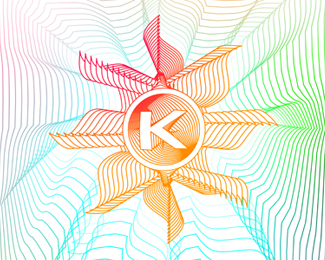
norden
by tass • Uploaded: Aug. 30 '10

Float
(Floaters:
19 )
Description:
work in progress. any suggestion on how can i improve it?
As seen on:
www.alextass.com
Status:
Just for fun
Viewed:
5088
Tags:
custom
•
custom made
•
branding
•
identity
Share:

Lets Discuss
i have chosen this type from my other options as i felt it had the most nordic/scandinavian air. thanks for the comment thou.**thank you all for the floats!
Replygreat icon.
ReplyThanks Paul!
Replylove this mate . Beautiful icon
ReplyBeautiful mark Alex
ReplyThank you both! :)
Replybeautiful mark mate!
ReplyThanks mate!
Replynice colors!
ReplyLooks great Alex.
ReplyThank you Chad, thanks Ivan! :)
ReplyReversed pentagram? Hmm, Alen, i think it can be associated more with a wind toy rather than a pentagram. It's just a (naive and playful) star why do you say that 'so some might make a trouble there'?**Thanks Vovy.**I will consider some new type options and if i'll find a better solution i'll update it. Thank you all for comments and floats.
ReplyDon't worry Allen, i took it constructive way, just wanted to understand your point of view thou. :) I just think that is very very far away of the negative connotations of the pentagram symbol. At least i don't think at that seeing this. **It does stay upwards, depends only the way you are looking at it, it's just a bit clockwise rotated to give it more twist.**Thanks Anthony. Indeed the type might be considerate cold. **Cold is the main theme when you think at nordic places and people. And yet when you have the chance of seeing and knowing them you discover a warm and colorful face that you would never guess under the appearances. This was my intention to show in the logo too. **The colors from the stars are inspired from the aurora borealis / northern lights (same in %22here - click%22:http://logopond.com/gallery/detail/114975 and %22here - click%22:http://logopond.com/gallery/detail/114974)that is the most touching and sensitive phenomenon in a place rather known as cold. **
ReplyAgain, i think that the symbol is very very far away of the negative connotations of the pentagram symbol. Any possible association was not intended. I really can't see the connection between them 2 looking at my symbol.
ReplyHmm... i know now why you have associated them. I think is just because at a smaller size (for example in the comments page thumbnail) it looks a bit like a reversed pentagram. I'll try fix that. Thanks for noticing and mentioning it.
ReplyShape %26 type updated!
ReplyOpinions about the updated version?
ReplyAnything? :)
ReplyGood thing i can rely on you Alen :)) Glad you like the symbol more/now, i did my best to avoid any possible negative interpretations of it. I have also edited the type and try a few other options but this one seemed again (for me) the best choice. This is another result that i've got %22http://logopond.com/gallery/detail/115240%22:http://logopond.com/gallery/detail/115240 , but i think i prefer this one better. Thanks for the comment again.
Replythis one is great, tass.*though, make the type a bit smaller and darker:p*(totusi parca as mai introduce ceva in fontu ala, nu stiu orice, ceva ce sa il faca mai viu, poate o culoare ceva din grafica, doar o idee..in rest, superba treaba, felicitari)
ReplyGood one tass!
ReplyThanks guys! :)
ReplyPlease login/signup to make a comment, registration is easy