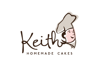
Keith Home Made Cakes (Concept 3)
by koodoz • Uploaded: Aug. 26 '10 - Gallerized: Aug. '10
")
Float
(Floaters:
52 )
Description:
New logo for a local bakery who has been established since the 60s. The client wanted a contemporary logo that incorporated the original owners caricature. See their current website for an example: http://www.keithcakes.com.au
As seen on:
Koodoz Design
Status:
Unused proposal
Viewed:
20730
Share:


Lets Discuss
Man that's too cool, love it.
ReplyThanks milo :) I love this one too. Unfortunately it doesn't entirely fit the brief but it was worthwhile showing the client a different style for the image of their business.
Replysweet
ReplyYummy, such a shame they didn't sink their teeth into this.
Replycool, but made me think of %22Bart's Logo%22:http://logopond.com/gallery/detail/18983
Replylooks delish!
ReplyIt%B4s perfect!
ReplyThanks for the comments. The client thought this didn't represent their store as it suggests a high end bakery - where as they are more focused on great tasting products at an affordable price.
ReplyGreat work. I could see this marketed as great taste - affordable price. Worth showing, and thanks for sharing!
Replyvery sweet!
ReplyNice!*Saw in Dri3ble)
ReplyThanks everyone for the comments. Perhaps we could convince the client to use this logo as a Special Edition/Anniversary logo.**@LogoLibre: Can you send me the link from Dribble, please? I can't seem to find it on there
ReplyIs the typeface used for 'Home Made' La Portenia De La Boca from Sudtipos?
Reply@kodoz I saw a glimpse, but if the logo meet again - I will write link in comments
Reply@saawan: I believe it is. I can't remember because I've outlined it. But it's definitely a Sudtipos font (I love their stuff!)**@LogoLibre: Thanks :)
Replylovely
ReplyI like how, even when seen small, it's obvious that this mark is for a bakery, yet is still unique enough to not be cliche.
ReplyBrill use of colour I like how you have it working as positive, negative, positive... and so on. Good use of type also.
Replythe first time i saw this logo ,i thought it was a bottle cap,finally it's a cake?anyway good job%3B)
ReplyGreat type, color, scale...everything. This is beautiful.
Replyvery elegant : )
ReplyThis is nice but it reminds me a lot of the logo for a cake company in Ohio. http://www.elecakeco.com/ I like yours better though.
ReplyWow! Perfect!
ReplyPlease login/signup to make a comment, registration is easy