brothers
by themaninh • Uploaded: Aug. 20 '10

Float
(Floaters:
12 )
Description:
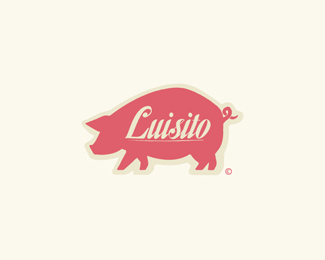
This brand was done for a pet shop. The idea was to create a brand extremely friendly and unique. So the font is a vectorized handmade. The graphic world of this brand was acompained by a range of resources and different kind of fonts and illustrations to create a fun, playful atmosphere.
Status:
Client work
Viewed:
3108
Share:


Lets Discuss
good work here, well done.
Replyagreed this is nice...
Replyvery nice... i love this colour
Replyreally nice. Like the type and colour!
ReplyI'm not crazy about the separation between each letter. In some spots, it makes sense, (Like between the 'r' and the 's' because the 's' curves back over onto itself.) but putting it in some of the other spots (especially between the 'e' and the 'r') looks really strange to me.
Replythank you guys! :)
ReplyPlease login/signup to make a comment, registration is easy