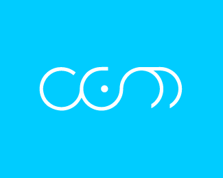
BrilliantlyGreen
by HelveticBrands • Uploaded: Jun. 01 '07

Float
(Floaters:
6 )
Description:
Something I have been working on lately. This was designed for blog (multiple authors) about making more environmentally conscious decisions. BrilliantlyGreen is about environmental issues, and about things that you can do right now.
As seen on:
http://www.dache.ch
Status:
Nothing set
Viewed:
6033
Share:


Lets Discuss
Very nice! Even if I'm not fan of green colour... and cocon. Congratulations!
ReplyThis reminds me a lot of the BP logo...especially with the overlays of green and lime.
Reply... and so proud to have my last release next yours :-)
ReplyThanks for the comments guys. It is fundamentally different senter, have another look :)
Replyi think the problem is that the bp logo is soooooo familiar that they share a commonality and evokes the bp image even thou they are different...
ReplyI know that it is different Dache...but do you really want a logo to have an immediate association with another companies at first glance? We all including myself have done something similar in our design history to someone else. But have we ever stopped to wonder why?
ReplyPlease login/signup to make a comment, registration is easy