Vital Imaging
by NoeticBrands • Uploaded: Aug. 11 '10 - Gallerized: Aug. '10

Float
(Floaters:
97 )
Description:
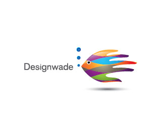
Vital Imaging is a successful medical diagnostic imaging company.
Status:
Client work
Viewed:
32512
Share:


Lets Discuss
realy nice
Replyagree!
Replyits nice at this size..
Reply%5E Agreed, will it work on the smaller ones? or it doesn't need to? I like it though.
Replycool looking!
ReplyThanks fellows. Well the smaller one works fine too without any changes, but if i remove the smaller dots in a small one it becomes perfect. BTW the client has embossed this design and it works way better than even swarovski's detailed swan logo. http://www.swarovski.com/Web_CA/en/index%0D*%0D*Offcourse I like the swarovski logo better %3B)
Replywhat can i say.. sick! very nice anatomy of the body.
ReplyVery nicely done, great concept:)
ReplyLike Deiv said - SICK!
Replyoooooooooooooooooooooo niiice
ReplyThanks Fabian, Leo and Mr. Sandhu! Much appreciated!
Replycool stuff
ReplyThis is really awesome, Riz. Sweet work!
ReplyBeauty Terry! Looking forward to seeing your type choice...
ReplyThanks Steve, Joe, Debashish and Fred. Font will updated soon.
ReplyVery-very interesting!
ReplyHey Nikita.. thanks!
ReplyVery cool.
Replywow, this really fits medical imaging, great work!
Replygreat stuff here riz!*I'm imaging a great animation with this one!
ReplyAppreciate it Sean..%0D*Thanks claude and Andrej
ReplyLooks great with the type!
Reply%5EYep. Looking good!
ReplyCheers Roko and Chad!
Replyto the point.
ReplyGreat stuff man. Feels so vibrant. I'd love to see a version where the mark is placed over the type.
ReplyCool stuff, Terry. Although i don%60t quite get the type.
ReplyAwesome work, Terry!
ReplyThanks fellas. Srdjan I used several font options but this is the one they liked.
Replycongrats on the gallery spot Riz! Keep it up man
ReplyRealy nice! very good :)
ReplyGreat logo Riz. Congratulations.
ReplyGreat work. I am not sure I get the dots floating off to the right of the figure. Probably relevant to the company, but it comes off as a bit of an unflattering figure to my eye. Love the concept!
ReplyThanks alot guys. @lumavine... I dont want to change anything on the design coz its already finalized but I appreciate your feedback!
ReplyReally amazing !!!
ReplyNice Riz : )
ReplyHey Vovy nashifan and Matty..appreciate it!
ReplyIm guessing you did all those dots yourself?
ReplyNo.. I hired a dotbot to do it :D.. JK. Yes I did them all.
ReplyConcepto muy bien elaborado del isotipo. Lectura dif%EDcil en peque%F1o tama%F1o. No me convence la fuente de %22Vital%22.
ReplyGracias por sus comentarios. El cliente ha finalizado este as%ED que no puedo hacer cualquier m%E1s developements en el dise%F1o.
Replyloving it :)
ReplyCHeers illumina*
ReplyPlease login/signup to make a comment, registration is easy