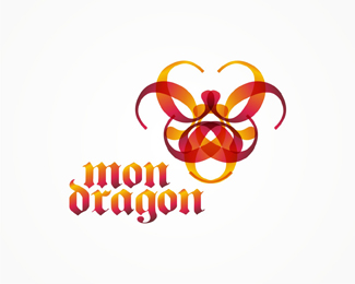
mon dragon
by tass • Uploaded: Jul. 12 '10

Float
(Floaters:
1 )
Description:
work in progress - typographic experiment - the dragon is build based on the letter c.
any suggestion on how can i improve it?
As seen on:
www.alextass.com
Status:
Just for fun
Viewed:
1729
Tags:
custom
•
custom made
•
branding
•
identity
Share:


Lets Discuss
I would suggest you to try a watercolor texture on the dragon, maybe a japanese style brush :) Otherwise is perfect. I love it.
ReplyPlease login/signup to make a comment, registration is easy