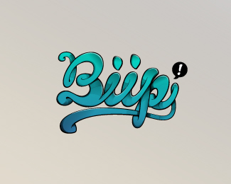
Biip (new#5)
by actiondesigner • Uploaded: Jun. 15 '10

Description:
Trying some different color schemes. New logo for Biip. Moving from mobile community to social community. Has to look aproachable and cool to the target audinece between 14 and 25 years. The breif from the client was; organic, playful, bold. Impressions; Has to look cool, a place where things happen, a place where your friends are, a place where you are the center, electronic love
Status:
Client work
Viewed:
5778
Share:


Lets Discuss
This colors fits the best for me.
Replynice type, i realy like it
ReplyThanks guys. Really happy with the type. And I think the colours are good on this one:)
Replygreat work on this one.
Replystrong mark n type flots..
ReplyThanks lecart and sbj:) Really happy with how it flows:)
Replycool type and great flow
ReplySo freaking beautiful. I dig it. Don't see organic, but doesn't really matter. Love the i's looking like two people connected. Very cool.
Replythanks guys:)
ReplyLove the feel. Great detail with the dimensionality!
Replyinteresting approach
Replysweet!
Replyamazing
Replythis is great, dude.
Replythis really nice !!
ReplyYour comments means a lot. Thanks all:)
Replywas cool to see this one progress, nice work mate
Replythis is great, fits the target market of 14 to 25 on the mark I think. fun,interesting and fresh.
Replyhttp://www.behance.net/Gallery/Typefunkography/216077
Replyshame on you!
ReplyHmm, that's interesting Simon. This does look a little over inspired. Notice the 'P'...they are very similar.
ReplyI hope author can explain it)
ReplyNothing to explain, blatant ripoff. What a joke.
Replyis it me...or i c Mr action always creating controversy?
Reply%5EI guess he's living up to his name, actiondesigner. Creating action because he always has shady designs.
Replygreat work, mate!
ReplyThis guy is clearly not Rodrigo Francisco. Is there no way to flag logos?
Reply...
Reply%5EWaiting for an explanation still, Srdjan? I am.
ReplyYep, still.. :)
ReplyWhy did not I already this? :%7C very cool.
ReplyOne word SICK! Nice one!
ReplyPlease login/signup to make a comment, registration is easy