vika jigulina
by tass • Uploaded: Apr. 29 '10

Description:
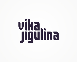
Logo proposal for Romanian music producer, singer and DJ Vika Jigulina. Vika Jigulina has made mixes with Steve Murrano, ATB, Tom Craft, DJ DOX, Steve Angello, Sebastian Ingrosso and other Romanian artists. She is vocalist in the international dance hit "Stereo Love" by Romanian producer and musician Edward Maya. Custom type.
As seen on:
www.alextass.com
Status:
Work in progress
Viewed:
3057
Tags:
custom
•
custom made
•
branding
•
identity
Share:


Lets Discuss
This got rejected. The initial task was to do something similar but different to James Zabiela's logo that you can see %22here%22:http://i463.photobucket.com/albums/qq356/a3ryal/james_zabiela_green_dolphin-copy.png I did my best to have a little similarity while is still original, and much more feminine. I am not very sure why was this rejected, but the client came with new, different ideas about what she wants.**I am curious, for me, how would you improve this, and/or what do you think is wrong about it?
ReplyI haven't listened to their music, but I don't think you'll get a satisfactory answer to the question %22what is wrong about it?%22. It looks quite nice as it is. Personally I would possibly have preferred a (slightly) lighter font weight and no line break because the v is wider than j. Without a proper feedback from the client herself, I don't think it makes sense to work on alternatives. Unfortunate, but it happens to many (When I worked on my last DJ logo who said he was looking for something minimalist and modern, he in the end pulled something pink, with an eagle, a crest and a violin key out of his hat.)
ReplyI am not quite interested in working alternatives for her. I'm just looking for opinions about how can i make it better for me. You might be right about the thin part, she mentioned that too at some point. I started from very bold/fat letters and maybe that's why i have considered this version thin enough.
ReplyThe descenders on J and G look quite heavy, and i think there are some some stroke issues as well.
ReplyOther than that i actually think it looks quite interesting and with some refinement it could turn our quite good. Sorry for 'double-post'
ReplySo J and G, ok, i'll think about those. *Thank you both for your answers.
Replyi personally do not like the 'i' it looks like not matching to the rest of the letters. also the j is too different if you compare it to g. also not so sure on how you aligned those two lines.*though, nice job (imi place) i like it, tass. keep it up.
ReplyI was thinking about the j compared to g too a few minutes ago. I don't remember why i've considered this solution to be the best for that letter at that time. **I guess i'll gather all your feedback, think about it and if i'll have the time i'll revisit the project. Even if not, all these messages are important for me for my future projects, so thank you all for them.
ReplyPS. And also for the feedback left on any of my other projects.
ReplyI quite like the overall look of this. I agree with what people have said about the strokes and the end of the descenders on g and j. Also not a fan of the top of the i's, I'd like them more if they were simply straight edged (to match the bottom of the n's too). I love how the words really fit together and the style seems well suited to the industry.
ReplyThanks Claire. It seems i have a second chance with it so i might actually try all this edits besides trying a new direction. Thank you all once again.
ReplyPlease login/signup to make a comment, registration is easy