Los Remansos 4
by EstudioValentini • Uploaded: Apr. 18 '10 - Gallerized: Apr. '10


Float
(Floaters:
67 )
Description:
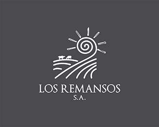
This is a proposal for an agricultural, livestock & poultry farming company Locate in De Lerma Valley in Salta, Argentina.
Status:
Unused proposal
Viewed:
18822
Share:


Lets Discuss
Thanks a lot Bronte! I hope my client think the same as you! *I agree with you, I like this one too. Please comment if there something to improve. Bye!*
Replythis look nice. the sun ray with empty white space inside?how about solid color, it just my personal opinion, and if the 2 %22cows%22 cab be a bit up-size, that will be good n more visible, now kinda lost. Overall i love this mark! :)
Replylove this mark just the way it is... agree with vintage_chic... all of them are excellent... this is going to be a difficult choice for ur client :)
Replyyou've got yourself a great, very nice showcase man.
ReplyThank you people for your comments and feedback! *Gary, you are right, I saw that when the proposals were send. I will try that with the cows! Thanks!
Replyi fel type need to be spaced better..i read...LOS REM A NSOS
ReplyYes Nitish.b! you are right, I'll correct that. Thanks man!
ReplyVery nice, I like this a lot.
ReplyI especially like the way the land flows into the sun. Good work.
ReplyNice idea to unite the sun and the hill!
Replyadri@n, LDM %26 Petro, thank you guys! I appreciate your comments!
ReplyVery nice, great 'feel' to it...almost has a bit of van Gogh about it. Well done.
Replythank you wooly! I appreciate your words too!
ReplyMissed! love it! :)
ReplyThanks a lot Pierro!!!
Replygreat feel here
ReplyThanks a lot Florin! coming from you, its an honour! your work is amazing! congrats!
ReplyHabiendo visto todos, me gusta mucho, como coment%E9 antes, el trabajo de la hoja que hiciste en el otro isologo...pero ac%E1, queda muy bien hecha la conjunci%F3n del sol con el campo...me parece un gran trabajo...!
ReplyMuchas gracias nuevamente Leonardo! La verdad que en el tiempo que llevamos dedicandonos a esto, es el trabajo que mas tiempo y esfuerzo nos llevo... El cliente no nos entrego un buen brief y no queria hacernos caso con algunos consejos y recomendaciones,lo que nos hizo trabajar muchisimo mas de lo habitual... Esta opcion es una de las que mas gusto, sin embargo a ellos no %3D(
ReplyIts my favourite logo in your showcase :)
ReplyThanks a lot Paul!!! I'm glad you liked it!!!
ReplyWow it is really awesome. I like it , this is one of my fav logo here. https://hpsupportassistant.org/
ReplyAwesome work , Thanks a lot for the post. https://customerservices.us/geek-squad-tech-support/
ReplyPlease login/signup to make a comment, registration is easy