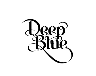
I would agree altering the e's would be a great choice, however I think you need to change them more. The second e should %22swoop%22 back more and interlock, the last e is fine as is. I believe the reason this is being questioned by some is because the change is so minor on that one e... I like how you've done it, just don't like how it interacts with the prior e. Just my thoughts... nice work.

Lets Discuss
Very nice, JD! What about having all 3 'e' letters the same?
ReplyType08. Yes was thinking this about the 'e's but as its a logotype I am trying to customise each character... am I trying to hard?
ReplyNah man, you have the right idea, Jonny. Slightly tweaking the e's makes it much more dynamic.
Replyyeah... you have the right idea with the e's... dont change em... good job...
ReplyI agree with Alen, the e's should be the same. Either way it looks great.
Reply%22Nah man, you have the right idea, Jonny. Slightly tweaking the e's makes it much more dynamic.%22**exactly...
Replythis is lookin great!
ReplyI would agree altering the e's would be a great choice, however I think you need to change them more. The second e should %22swoop%22 back more and interlock, the last e is fine as is. I believe the reason this is being questioned by some is because the change is so minor on that one e... I like how you've done it, just don't like how it interacts with the prior e. Just my thoughts... nice work.
ReplyThanks fellas, interlocking e could be good.
ReplyYeah I dig the different Es. more custom
Replynice look....this one is getting better
ReplyThis deserves a lot more love.
ReplyWow! Great type! :)
Replybeautiful lettering
Replywow ... that's special !
ReplyThis is fabulous. Nice, nice work.
ReplyWonderful typography!
Replybest in series.
ReplyPlease login/signup to make a comment, registration is easy