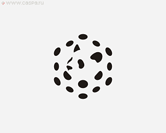
Max Valels Lab
by LOGOPED • Uploaded: Apr. 03 '10 - Gallerized: Sep. '10

Float
(Floaters:
66 )
Description:
The graphical design is based upon a closed-circle linear ligature, its meaning being the harmonious and inseparable union of science and nature, the amalgamation that is the key tenet of the company’s business. The visual technique used – shape deflection – is an emotive and collective image, in which one can see virtually alchemical transformations of the various elements of the periodic table, the process whereby one aggregate state changes another, the beauty of the golden proportion, the plasticity of the shapes of flasks and test tubes.
https://caspa.ru/portfolio/max-valels-lab/
Examples of developing logos and corporate identity https://caspa.ru/
8 (903) 659 53 04
caspa@inbox.ru
#branddesign, #designer, #branddesign, #branddesigner, #logodesigners
As seen on:
Status:
Client work
Viewed:
18263
Tags:
logo concept
•
restyling
•
form style
•
logo design
Share:

Lets Discuss
Always been a fan of this one. The branding is excellent as well. Great you have, bro.
Reply%5E Sorry, great WORK you have.
Replysuper
ReplyHave you uploaded this before, or am I just thinking of seeing it on the site? Either way, I've always been a fan of it.
Replysuper :)
ReplyI've seen this one before. Still amazed.
ReplySo good it's in the gallery again. Why do you keep deleting and re-uploading your logos?
ReplyVery nice.
ReplyI love this!
ReplyPlease login/signup to make a comment, registration is easy