zephyr
by zephyr • Uploaded: Apr. 02 '10

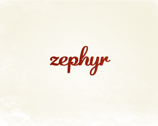
Float
(Floaters:
23 )
Description:
New personal identity. Old one can be seen at www.zephyrcreative.ca.
As seen on:
www.zephyrcreative.ca
Status:
Nothing set
Viewed:
2497
Share:


Lets Discuss
Time for a change...
ReplyLooks great! Do you think the bounding object is necessary though? Think the type is strong enough on its own...nice work on it though!
Replybeautiful
Replywelcome zephyr! like it.
ReplyVery warm and friendly. Nice job.
ReplyI was with Houston in his comment but now that I see your latest version without the box I still prefer this one. The problem for me is how close the strokes of the h and y come to the edge of the box, it causes a slight tension. Hmm. Good work though, welcome aboard.
ReplyThanks all! I'm thinking this will be the version I go with...**@Sean, good eye! I'll adjust the box to give the h and y more space to do their thing :)
Reply@Justin - Agreed!
ReplyDig it a lot!
ReplyThanks Michael! Working on final revisions... will post updated version soon!
ReplyThis is pretty cool!
ReplyThanks a lot, Cerise - great new mark yourself!
ReplyPlease login/signup to make a comment, registration is easy