Perface
by filiperocha • Uploaded: May. 28 '11

Description:
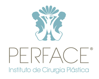
The naming Perface is meant to be perfectly understandable and pronounced in two languages: portuguese and english. Originated by joining two relevant words, perfection and face, the name conceived communicates with memorable sonority the beauty concept, a natural attribute that can be enhanced by aesthetic interventions allowing patients to regain their physical and mental balance.
The Perface brand contemplates a simbology of distinct elements that are associated directly and indirectly with the plastic surgery universe. Feminine silhouettes formed by the contrast between foreground and background figures are harmonically integrated with masculine profiles, whose reflection denotes the pleasant state of felling good with himself by looking at the mirror.
The perfection of a flower, synonym of beauty, is denoted by a crown of petals, which in addition to that interpretation connotes a peacock tails display as part of courtship.
The feminine figures with uncovered breasts suggest a contemporary visual reading of ancient greek and roman statues such as Venus de Milo, whose classic beauty standards continue to be admired nowadays.
Combining the invigorating aspect of the green and the serenity quality os the blue, the turquoise evokes thoughts of soothing, restoring our sense of wellbeing enabled by the association with the color of water and sky. It is a color that most people respond to positively and by being universally flattering, has appeal for both targets: men and women. Elected as the color of the year for 2010 by the global authority on color, Pantone®, the turquoise is classified as a very special color in many cultures. It is believed to be a protective talisman associated with deep compassion and healing, and a color of faith and truth. Its vivacity is elegantly balanced by the neutrality of the fawn used on the logotype.
The Perface logotype is originated from an exclusive typography development. Its sophisticated and modern character design correspond to the symbol graphic style.
The final composition lies on a symmetric solution with an emblematic iconographical unit that synthesize the set of values associated with the beauty quotient optimized by the institute.
As seen on:
Status:
Client work
Viewed:
1125
Tags:
Profile
•
Feminine
•
Silhouette
•
Plastic Surgery
Share:
Lets Discuss
very nice crest like work !
ReplyPlease login/signup to make a comment, registration is easy