Hamburger Mary's - Seattle
by JeffFisherLogoMotives • Uploaded: Jun. 07 '07 - Gallerized: Jan. '08
Description:
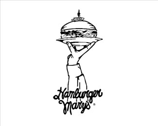
A hamburger takes the form of the Space Needle in this 1991 full-page newspaper ad illustration, executed with a rapidiograph pen, that became the logo for the Seattle restaurant. The hand-drawn text was inherited from the previous identity. The design is featured in the Japanese books 'New Logo and Trademark Design' and 'Logo and Trademark Collection,' as well as the Spanish volume 'Eating & Designing.'
As seen on:
Logo Notions
Status:
Nothing set
Viewed:
11901
Share:
Lets Discuss
Absolutely timeless. Theres almost another needle upon a needle. Luv it!
ReplyBrilliant design, wish it was executed a little better. The line quality will not hold up at smaller sizes and the type runs together a bit much for my taste, but a great concept nontheless.
ReplyThis is really cool. As logomotive says, the type isn't quite as legible as I'd like it but there's something really nice and individual about it!
ReplyFunny thing is that at small size it looks like a guy with a platter on his shoulders (atlas style) with his arms up holding the plate. I thought it was a 'Worlds biggest hamburger' logo.**I like it - but think there's no consistency of line weight.
ReplyPlease login/signup to make a comment, registration is easy