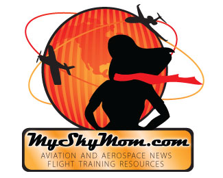
Sky Mom Logo
by MrCongeniality • Uploaded: Aug. 02 '10

Float
(Floaters:
1 )
Description:
Client wanted to revamp her logo. Any comments or suggestions?
Status:
Client work
Viewed:
776
Share:


Lets Discuss
I personally don't think that the silo of the woman is working well. The shape of the hair makes her head look odd. I also don't think you need two planes - it's overkill IMO. And the vertical lines in the circle don't seem to have a reason for being there. Finally, the rectangular box looks like a complete afterthought and doesn't integrate well into the rest of the logo. You should devise a way to make it look like part of the overall design. Sorry to sound so harsh - I'm not trying to be a jerk just stating my opinion.
ReplyThe whole thing is too busy.
ReplyPlease login/signup to make a comment, registration is easy