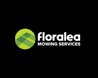
Dallas' Mowing Services
by LloydCreative • Uploaded: Apr. 30 '09

Float
(Floaters:
3 )
Description:
Logo for lawn mowing and property maintenance company.
Status:
Nothing set
Viewed:
2888
Share:

Lets Discuss
ah, this is actually pretty clever. I like the D looking like an M with the blades of grass.
ReplyThanks Trish - nice of you to look in.
ReplyNice clean D. Why the possessive apostrophe?
ReplyThanks for the comment Glenn. The possessive apostrophe is part of the company's registered name. The guy who owns it is called Dallas, so it relates to his ownership of the business. Probably should be Dallas's to be gramatically correct... But the name wasn't up for changes.
ReplyNo this would be grammatically correct (the extra s would be wrong). Looks nice.
ReplyNot that you copied this one but when I saw it, it reminded me of this one, great designers at Hornall Anderson works, check it out. http://www.hornallanderson.com/?%23/project/75/
ReplyRudy - thanks for looking in - and thanks for the link to HADW - guess it shows there's not many brand new ideas out there - or maybe it's a case of great minds thinking alike : ) Have always loved HADW's work - they are inspirational, but had never seen this particular concept before. Maybe I should get my client to rebrand as Dallas' Mammoth Mowing Services!
ReplyNo biggie Alex, it happens and like you said, great minds think alike, you have nice work to back it up!
ReplyPlease login/signup to make a comment, registration is easy