Ditto
by vintagesignman • Uploaded: Jul. 21 '08
Description:
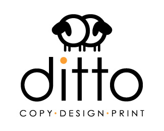
Ditto logo
Status:
Unused proposal
Viewed:
2360
Tags:
vintagesignman
Share:




Lets Discuss
Yellow dot on i is a bit distracting and not needed IMO. Is this the famous cloned sheep?
ReplyI love the mark. I think you can find a better font to compliment though. Have you tried something with rounded edges? The wordmark might even look better to the right of the mark.
ReplyI didn't know what the mark was until i read the sheep comment. Are they sheep?
ReplyI really like the idea though. I also agree w/comments about the yellow dot.
ReplyAre the sheeps legs by an chance supposed to be ditto marks?
ReplyThanks you for your comments, yes they are %22the%22 sheep. I thought it was a good icon to use for a %22copy%22 company. I see the ditto legs, I didn't do it intentionally. I see now what you mean by the orange, the customer did like having some color.
ReplyLove the icon. The type and scale could use some polishing.
ReplyPlease login/signup to make a comment, registration is easy