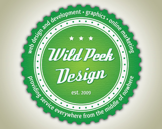
WPD logo
by vincep • Uploaded: Mar. 15 '12

Description:
First ever try at a retro style badge for personal use. Business is located out in the middle of nowhere in SK Canada. Love retro, trying to find a way to incorporate it into the business.
Status:
Just for fun
Viewed:
859
Tags:
retro
•
web design
Share:
Lets Discuss
It's a good stab at a retro logo. A few suggestions: I think your wavy border is a bit too pronounced and the waves need to flow into each other a bit more gradually. Right now they almost look like gear teeth. I also think you should slant %22Wild Peek%22 on the same plane as %22Design%22 if you're going to keep them in the same font. Finally, the color green you've chosen doesn't feel very retro - try more muted tones. Would love to see an update.
ReplyThanks for the feedback, much appreciated! Will definitely post an update when I get to it.
Reply%5E agree with Steve's pointers.*Also I might try the design with all the outside copy for now and just get the design as a whole nailed down.*Also maybe try something with graphic evergreen trees instead of stars. Or as the border. I t gives reference to the %22middle of nowhere%22 for me. Just some thoughts. good luck. nice start!
ReplyThanks! I was also missing (and looking for) the connection with nature/back country as that is an important part of my business profile/branding.
ReplyPlease login/signup to make a comment, registration is easy