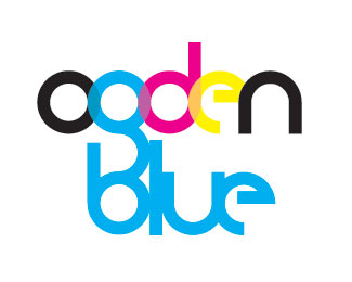
Ogden Blue Cyan
by universe8000 • Uploaded: Apr. 27 '10

Float
(Floaters:
2 )
Description:
Logo design for Ogden Blue, a art supplies store. They also do logos and graphics so this was tough to do a logo for them, and I don't think they will use it. But, it was fun to do. This version is simple and not as colorful. It is self-made typography. I also have one done with CMYK.
Status:
Unused proposal
Viewed:
1181
Share:

Lets Discuss
Excellent work, very clean looking font!
Reply%5E then thank the FONT designer.
ReplyPat yourself on the back.
ReplyLogomotive, *Please read the description next to my logo. It clearly states that it is SELF-MADE typography, which it is. I will indeed thank the font designer, which is myself, like you suggested. I have been to your page and I do like some of your logos, so either give some actual feedback from a professional viewpoint or please do not make comments like that before you read the description.
Reply%5EI think if you read mikes second post he is exactly saying that. so group hug everyone.**On the logo, feel the N and U are a little to wide, I would look at chalet 1970 and Bahamas to get a feel of how they treat those particular letterforms. Also I found it hard to read the name ogden, would feel a horizontal alignment would suit it better so that one sees the g.
ReplyPlease login/signup to make a comment, registration is easy