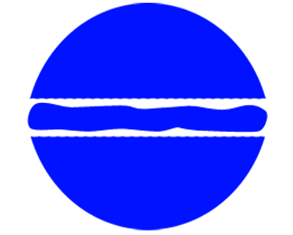
Blue Dot Burgers
by trueedge2097 • Uploaded: Oct. 05 '10

Float
(Floaters:
1 )
Description:
Another study for Blue Dot Burgers logo, a bit more detailistic.
Status:
Just for fun
Viewed:
3407
Share:

Lets Discuss
Anthony, your comment is a touch unkind. I welcome criticism of my art, but you've not done so. If you have a problem with my logo, or any of my logos, tell me what you think the problem is. It's completely fine. sdijock did for one of my others. That's how art works. **Your statement smacks of %22I'm good - you're bad.%22 I will certainly be observing the works of others. But I'll be posting my designs as well, both good and bad. I expect criticism. But make it where I can use it, not some vague %22just look around you%22 mess. That doesn't help anybody.
Replytrueedge2097 I happen to agree with Anthony. Everybody make crappy designs at some point, best is to learn by looking at what's around you. Pretty much what Anthony is saying, is that you should restart this design properly. Judging by your logo showcase and Anthony's I would say that he is better than you are.
ReplySkeermes, it doesn't matter who is better and who is not. I agree I make crappy designs from time to time. That's not the point. Every artist does. What you guys should do in that case is point out the flaws and tell me what I can do to make it better, not hold it over my head that I'm bad. That doesn't help anyone. **Yes, I'm going to learn by observing. But as artist must attempt as well. That's how we grow. So don't just tell me %22look around for a while.%22 Tell me what I can do to improve. I don't care who's better than me. That's not what we're here for.
ReplyI just signed in, haven't yet uploaded any of my designs and my portfolio is very light, but... honestly... I really can't see how Anthony was unkind. He was actually very kind. You should really try and look at other designs to better yourself.%0D*%0D*But I also get what you are saying, you kinda went to emotional on your response but I also get that, every design feels like a child, like your own flesh and blood, so if anyone doesn't like your child you go all angry mom on them, I can be like that.%0D*%0D*Now back to the original point, I get what you are saying... both Anthony and Skeermes didn't really give you that much help because we should always be mindful of our peers, and maybe you are doing that. So... I'll try to help:%0D*%0D*The problem is your design is not on a good path. It's very flat and boring. Try adding a little bit of perspective to it, what would this blue burguer dot look like from an angle? Also can you play a little with the color? Throw it around a bit. Are you considering how %22Blue Dot Burgers%22 will appear there? Cause that's a pretty long name, how will the name be associated to the dot?%0D*%0D*I hope this helps, and I also hope you get my criticism, cause you can read it in so many ways, but keep in mind we are all here to help each other.%0D*%0D*Hope to hear from you on my first upload. Cya there
ReplyTotally agree with Anthony...honestly, the words are kind enough i think!
ReplyAgree with the above, Anthony's approach was definitely constructive and was in no way trying to be insulting. The content of his critique may have offended you, but he had good intentions.%0D*%0D*I would agree with ricardohp on his thoughts on what you could experiment with. I would also play with different blues, because this one seems like it's glowing. and definitely play with including the name. shrink the mark down and let there be some white space around it. %0D*%0D*good luck.
ReplyWell, I really appreciate the waves of views I've gotten. You guys are giving me good advice. I do believe Anthony and Skeermes weren't trying to be unkind, but the fact remains that they didn't offer anything constructive. That's what bothered me. But thanks to those since who did.**But here's some things to bat around: aren't many fast food logos rather simple to begin with? Burger King is just the words in a circle. McDonalds is just a set of arches in an M shape. So on one hand, I don't see simplicity of this logo as my problem. **Also, the restaurant in question is right now just a hole-in-the-wall place. ANY logo would be an improvement (even an amateur one). This isn't a franchise yet. I didn't name the place, so I have no choice in that matter. I'm just trying to make something simple that will speak. **Thanks to many of you who have posted suggestions. Any more would be appreciated.
Replyis there an execution that wouldn't require the whole logo to appear in a solid blue?
ReplyWell, the place is called Blue Dot Burgers. The idea here was to make a blue dot that IS a burger. There probably is another way. I just believed this was the best idea for the first attempt.**But then again, a lot of fast food brands use solid colors other than black and white. Jack in the Box is a solid red box with white reverse type. White Castle uses a blue and white castle with white reverse type. I don't know, megashred. Good question. Thanks.
ReplyTry make it smaller and pick less offensive blue. Also I think it would look better if this cut out circle was less solid and more fun. Hope this is constructive enough for you. Good luck with it mate.
ReplyI don't think you'll have much luck trying to make it look like a decent burger by trying to draw a side view. At best it will look like a burger gone wrong made with two bun lids.*One problem you have is the colour blue in general - it is not a food friendly colour. Since there are virtually no naturally blue foods, people are usually put off by normal food coloured blue - this is not what you want your logo to do! This is why most fast food brands use red and yellow because they are more appetising colours.*Non-food things can be blue (text, castles, plates, etc.) but a blue sausage or a blue strawberry is not good.*One idea would be to take the shop name literally, go for the ultimate simplicity and just use a blue dot. A solid blue circle, nothing more.*Of course there is something more, the name of the place. The trick here is selecting a decent font, but it could be a common font for your application. Try this on for size:*Blue*Dot*Burgers.*Makes the letters red and the full stop blue. That's it. The blue dot will stand out like a sore thumb. It's simple and distinctive.*You don't have to sell burgers, burgers sell themselves%3B you just have to sell your brand. Here your brand is unadulterated simplicity.*On the other hand, if you want to make a blue dot that looks like a burger, I would go for more of a plan view, maybe just angled down slightly. Then identify it as a burger with some white sesame seeds on top. If its not instantly recognisable as a burger then steal a device from one of the most iconic logos in the world and take a bite out - just make sure the scale is accurate.*That's my two pence :-)
ReplyThanks, petelea! You've given me a lot to think about. I'll think I'll try this a number of different ways!
ReplyPlease login/signup to make a comment, registration is easy