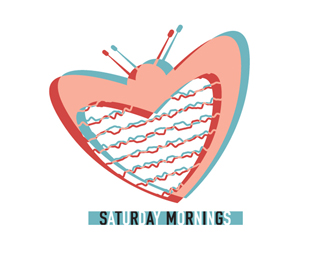
Saturday Mornings
by thewindofchange • Uploaded: Jul. 12 '09

Description:
This logo was designed for a store that sells vintage cartoons and toys.
As seen on:
Status:
Nothing set
Viewed:
1716
Share:
Lets Discuss
somehow, the animation makes sense to me. i think it's the colors. the thing that seems to be hard to see is the type -- the white type disappears. it's also too close to the other letters %5Bblack ones%5D....and unfortunately, i have to squint to read it. it's also reaaaalllly small type in proportion to the logomark. would you like to balance it out and see where that takes you? i'd fool around with it if i were you. :)
Replyyep...cool except for that type. Forces the brain to read STRA MRIG.
ReplyPlease login/signup to make a comment, registration is easy