sultan
by tass • Uploaded: Jul. 14 '10

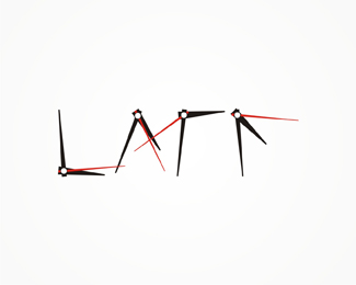
Float
(Floaters:
1 )
Description:
work in progress.
any suggestion on how can i improve it?
As seen on:
www.alextass.com
Status:
Just for fun
Viewed:
1569
Tags:
custom
•
custom made
•
branding
•
identity
Share:


Lets Discuss
I like where this is heading to! I think mark need some tweaks maybe is just to bold. For the type I suggest to get rid top left part of %22a%22 and make straight connection with %22T%22 maybe you can use same bold connection as you have between %22s%22 and %22u%22.
ReplyI think you've got a good point about the a, don't know why i didn't think before, thanks for the tip, i will try that and re-upload it, thank you!
ReplyType updated. Better now?
ReplyTop is better bud to me %22a%22 is now quite to close to stem of the %22T%22. I know you tried match spacing as with %22su%22.
Replyyep, got me on that one. i have tried a few variations, but wasn't happy with them. should i use %22ul%22/%22an%22 spacing maybe? i'll give it a try. thanks again.
ReplyPlease login/signup to make a comment, registration is easy