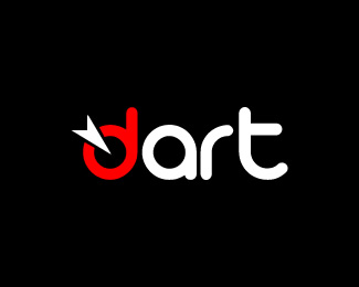
dart
by skoulix • Uploaded: Jul. 30 '09

Description:
I'm trying to make a fresh start for my freelancing web design/development business. I'm redesigning my corporate id to better reflect my business approach. I'm not a hardcore logo designer but before to turn to real logo professionals I though to give it a try by myself. You see, budgets are very strict these days :-) . The tagline is targeted communications and I wanted this to be integrated into the design. I guess the logo is rather simple but I want to keep things like this. I like the fact that the letter "d" stands out and leaves the word "art" to be readable by itself. Maybe like "digital art" or something like this. It depends of how you look at it.
Comments are welcomed.
Thanks
Status:
Unused proposal
Viewed:
2076
Share:
Lets Discuss
I like your approach. Nice work for not being a 'hardcore logo designer.' :)
Replythanks, I really appreciate your feedback.
Replyyeah good stuff for not being %22hardcore%22...digging the whole Digital ART. what font is that?
ReplyThanks ogtbarnes. The font is %22Arista%22 and you can find it at DaFont.
ReplyPlease login/signup to make a comment, registration is easy