3D
by shorty • Uploaded: May. 22 '08
Description:
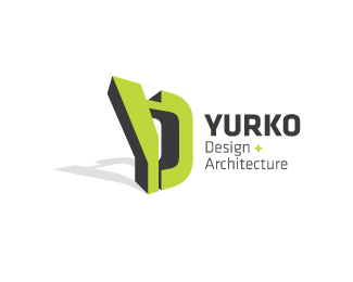
Logo suggestion for a architect company
Status:
Nothing set
Viewed:
1255
Share:




Lets Discuss
This thumbnail caught my eye, but the mark seems unbalanced and a little awkward to me for a design and architecture company.. It may just be me, though %3B)
Replyi like this but something seems missing, the bottom of the y seems a little narrow and the top bar joining the two letters might look good if it was the same depth as the letters. just my thoughts.
ReplyHi people**Thanks for your comments, I see your points. But its made that way on purpose, I want it to be abstract and grab the viewers attention %3B-)**The crossbar is actually designed to form a %22A%22(if you rotate the symbol).
ReplyPlease login/signup to make a comment, registration is easy