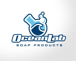
Oceanlab Soaps
by rikablade • Uploaded: Feb. 27 '08
Description:
Identity for soap developer, manufacturer and distributor.
As seen on:
Status:
Nothing set
Viewed:
2089
Share:



Lets Discuss
I'd like to see a bit more thickness in the strokes of the %22e%22 and %22a%22 for readability but I really like the feel of it, nice and clean. I'd almost say you could do without the wave in the beaker though, or at least a more subtle version of it. Nice work.
ReplyThis is an arbitrary thing, but I think the bubbles should be coming out of the beaker. They seem random where you've put them. The type certainly looks like something that would be on a soap wrapper in a store but I'm not sure the beaker graphic on the whole is working along with it just yet. I'd dial down the cartoony-ness a little and maybe play it a little straighter.
ReplyI like this a lot! I think my only criticism is that it looks more like a logo for a surf/skate shop then a soap company, but that might be what the client is looking for.
ReplyAgree that bubbles %22should%22 be at the opening but I don't know if that'll work. Visually this is nice. What about a version with the beaker being the O in Ocean?
ReplyPlease login/signup to make a comment, registration is easy