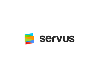
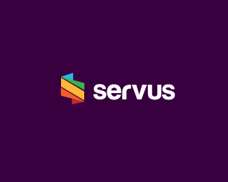
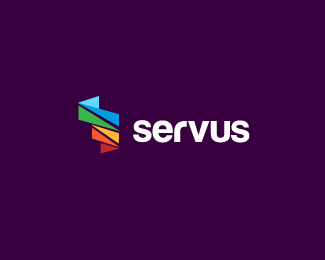
Servus
by ricardobarroz • Uploaded: Sep. 27 '12

Float
(Floaters:
10 )
Description:
FeedBack Please!
Consulting Services company
Status:
Work in progress
Viewed:
4733
Tags:
S
•
id
•
design
•
inspiration
Share:
Lets Discuss
Feedback - This one is the best of the 3, I see that you're settled with the type, I wouldn't have kerned it so tightly (but that's just a personal preference). In terms of critique I think there needs to a little more consistency with the triangular shapes that make up the mark i.e The yellow/orange one is gigantic in comparison to the blue ones.
ReplyAlso in terms of colour, the blue & red at the bottom contrast each other & define the two different shapes, where as the top blue & green don't have that same definition. Hope this helps.
Very thanks @hayes! i'll work a bit more! :)
Replythat r is bugging me, i jsut doesnt feel right to me
Reply...the client likes this typography...
Replylike the direction of the mark, Hayes has a very solid observation :)
ReplyThanks, @Dotflo :D
ReplyPlease login/signup to make a comment, registration is easy