hhp
by pryczkat • Uploaded: Aug. 19 '10

Float
(Floaters:
12 )
Description:
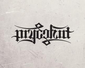
logo for historic hotels in poland
As seen on:
pryczkat.com
Status:
Unused proposal
Viewed:
1462
Share:


Lets Discuss
This is strong. It gives off a nice historic feeling.
ReplyGotta agree. Very nice mark. Something isn't though between the mark/type.
Reply%5ESomething isn't balanced between the mark/type.
ReplyYeah, I agree. It needs to be heavier in weight to relate back to the heaviness in the mark. It's also a little tightly tracked. I'm assuming that's because of the length of the name.
ReplyGreat mark and very classy. Type just needs sorting re comments above.
ReplyGreat work, very strong symbol. Swietna robota !
ReplySwietne
ReplyPlease login/signup to make a comment, registration is easy