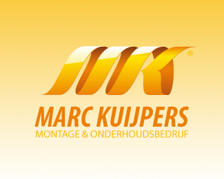
Marc Kuijpers
by proboxdesign • Uploaded: Jun. 28 '08
Description:
logo reject for a building company
Status:
Unused proposal
Viewed:
1757
Share:
Lets Discuss
I think it needs another vertical stroke. I read it as NK
ReplyI love the wood shaving analogy and the execution, but tend to agree with Nima. I think it's too yellow overall. What's it like without the background?
ReplyPlease login/signup to make a comment, registration is easy