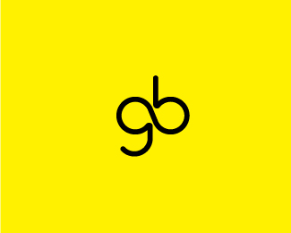
springboard II
by oska • Uploaded: Jan. 11 '10

Float
(Floaters:
3 )
Description:
an upcoming experiential marketing company. second attempt.
Status:
Unused proposal
Viewed:
1382
Share:


Lets Discuss
The g/b ligature reminded me of one of my own. http://logopond.com/gallery/detail/1911
Replytrue that, kevin. the g/b here were begging to be tweaked :) but my inspiration on this was the infinite mark, hence the ligature.
ReplyJust curious: how does an infinite loop %5Binfinity loop%5D connote the motion of springing forward? Not sure if an endless loop %5Bwhat the graphic representation of infinity usually means%5D equals progress or going forward.
Replyjf, the infinity loop is not does not have a literal meaning in the logo other than just a graphic inspiration of the g/b.
Replyoska, it's a good attempt. I like the fact that you attempted to use the natural curves and shapes of the letters to produce something interesting. Unfortunately, if it has no meaning for the company's identity, then it probably shouldn't be there. People will ask the business owners 'what's that mean?' and your client will have no answer%3B people like answers. It doesn't make the client look good, and your client wants to look good, right? I suggest you go in another direction with this. %0D*%0D*This is what I do when I have a tough time figuring out what to do with a logo. I look a the client brief %5Bif you have one%5D, the fundamental shapes of the letters %5Bare they inherently square or round?%5D, and the feeling of 'masculine' or 'feminine' that's associated with the brand. Then, I let those answers take me in the direction they add up to. Try thinking of all those things, and see what you come up with. Good luck with it.
ReplyPlease login/signup to make a comment, registration is easy