FLIP
by oias • Uploaded: Feb. 27 '11

Description:
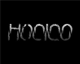
The interesting Fact about this Logo, wich i´m proud of is the Structure of the Typo, as the name says FLIP it an you´ll see what i´m talking About.
Status:
Work in progress
Viewed:
2249
Share:


Lets Discuss
Different style but Flip, as an ambigram, has been done: http://logopond.com/gallery/detail/66744
ReplyHi Sean, thanks for the link by the way i haven%B4t seen that logo before, in my opinion a lot of people came with the same idea, but as you say different style, colors typo, etc. On this business it%B4s common to see this situations but i guarantee you i came out with the idea that%B4s why i%B4m proud of, the design took me about 6 hours thinking about the typo, colors not an easy task.**I Appreciate your Comment, that%B4s why i came here for the Feedback i love it %3B)
ReplyHi Alexandre (@heavy_designer) *M8 Thanks a million for your opinion*I appreciate it so much, seriously.*Sometimes people see a concept, a *says I already saw that before, and*create something completely different*it%B4s a huge task for Designers nowadays*imho, but of course it is possible.*And the similarities always happens, *in this case i took the word FLIP and*for me the obvious idea was to flip the*text, before this logo, I never made a *research before of the logos done before,*that%B4s why I took the @sean heisler *critique and it helped me in a way.**Well again I thank your comments Alexandre. ***
ReplyI agree with you 100 percent, that%B4s true reinventing *the ideas is the key, once again thanks, and yes I%B4ll*post more of my works here, (I%B4m a bit slow by the by)*but def I%B4ll do it :)*
ReplyThank you for the Float Sacrim! :)
ReplyPlease login/signup to make a comment, registration is easy