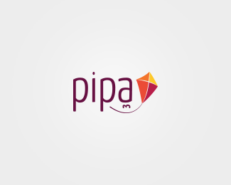
Pipa
by nissinmiojo • Uploaded: Jan. 29 '12

Float
(Floaters:
1 )
Description:
Pipa Estúdio
Status:
Work in progress
Viewed:
1345
Tags:
pipa design
Share:

Lets Discuss
c'mon people! i'm really seeking some critiques (good or not). i'm stucked on this. some people liked, some people not. and about you?
ReplyI like the kite icon, not a big fan of your typeface choice. I wonder if the kite needs to be as big in comparison to the type. I think the typeface choice for the tagline is fine, but I'd increase it a weight, as it is hard to see as is. Hope this helps.
ReplyThanks Hayes! I'll try this. I already made some modifications over its typeface, and now I'm trying to make the bubbles a little soft. I'll post a updated version soon. Thanks for your opinion!
ReplyI do love your tree work dude, this one is fine and just like hayes said...I don\'t quite agree on the typo that you have chosen! :)
Replyhi hanuman! thanks again! we have chosen another option in the end, so I left this one behind. curiously, the chosen version has the same type of this one haha!
ReplyYou can see the approved version here: http://logopond.com/gallery/detail/170146
See ya!
Please login/signup to make a comment, registration is easy