Hexen
by midgar • Uploaded: Jan. 05 '09
Description:
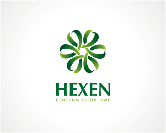
Hexen - credit center, one of concept logos proposed to the client. As of today he thinks it is too "knotty". What do You think? Every comment will be appreciated.
Status:
Nothing set
Viewed:
3216
Share:



Lets Discuss
I think it works well. It has a %22managed%22 sense of feel to it and also feels secure. I also like that the letter 'H' can be seen in the mark. Perhaps the mark is a tad bit too far from the wordmark and the tagline is too small
Replyi agree with ocularink, great mark!
ReplyPlease login/signup to make a comment, registration is easy