Vivido design
by michiel • Uploaded: Feb. 13 '08

Float
(Floaters:
10 )
Description:
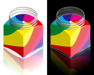
Vivido design is my own work label. And this logo will probably be v1 of a serie to follow.
As a reference to basic elements of graphic design I wanted to combine the vibrant primary colours with an iconic ink bottle.
While keeping it clean (no ink spills) for now, with the little dynamic in the colours I hope it triggers ones imagination.
As seen on:
www.vivido-design.com
Status:
Nothing set
Viewed:
2924
Share:
Lets Discuss
I couldn't help but take a closer look. Interesting idea. Maybe you don't need the reflection? Any chance you can create this with out any gradients? Even so, I'm intrigued. :-)
ReplyI like the idea. I couldn't tell it was an ink bottle though. And I'd agree with Ocularink, if the reflection isn't adding anything, you should consider removing it. I think all you need to do is work on exactly what the ink bottle will look like and you're well on your way.
ReplyOh, and to elaborate a little more...the bottle looked like a box with three rings on top of it. I had to read your description to figure out what it was. Albeit, I didn't stare too long to figure it out, but a good logo needs to read well when someone glances at it.
ReplyThanks for the comments OcularInk and SpiffyJ!**I posted a bigger version of the logo here:*http://logopond.com/gallery/detail/24950**A challenge I wanted to put myself up with was to give the ink bottle a nearly real, but surreal look while drawing in vectors only. The floor reflection was a dilemma for me too. Because of all the so called web2.0 gloss and reflections all around I feel strongly about staying far away from it. But in this logo I think it's good to use the floor reflection to show it's standing on a surface instead of floating.**It's probably also related to the environment I have in my mind for the website I'm working on for Vivido design right now. (hopefully online soon) I think it just fits the picture.**OCULARINK%3E without any gradients? If you refer to the gradients used in the glass of the bottle, I think it's hard to do without them. It would end up being a whole other logo. Naturally I started out with just lines and solid shapes, but at that point it really just looks like a box with rings on it like SpiffyJ mentioned.**SPIFFYJ%3E making it a more obvious ink bottle is indeed something that I hope to achieve better sometime. It seems that the twirl of colors inside it doesn't help much with clearing up the confusion. :-)**Any hints on how to achieve better recognizability would be much appreciated.
ReplyI do think that when people would get acquainted with Vivido design through the presentation in my website (to come), the recognizability would already be much less of an issue.**Though this might be an untraditional approach to logo design, would that make it less succesful? (I'm seriously asking)**Also since I can't imagine how people experience the logo when not actually knowing what it is supposed to be, I'm very curious to know if that unknown shape that they experience is still appealing to them and would have the general recognizability that I'm hoping it to have.
ReplyI think this is brilliant. I agree with the others that the reflection is a bit too much. It'd be nice to see with a much more transparent reflection, or none at all.**Well done!
ReplyThanks a lot peterehat!**I do agree that the reflection could use some more transparency. For now I'm working hard on the website, the logo will probably get updates again along the way.**I'll make sure to repost it here when that happens.
ReplyI love it, would love to see it without the reflection though
ReplyI agree, lose the reflection, they're getting old now.
ReplyPlease login/signup to make a comment, registration is easy