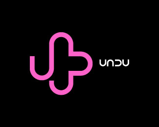
Undu Rev1
by makote • Uploaded: May. 19 '07 - Gallerized: May. '07

Float
(Floaters:
50 )
Description:
I made some little changes to it mostly on the left u's and also im trying 2 color combos
As seen on:
Status:
Nothing set
Viewed:
16607
Share:

Lets Discuss
On the bottom U where it is cut off on the left, can you try cutting it at the same curve of the first U at the left? This way it won't be so abrupt. Does that make sense? It would also be cool to see a version where none of the letters connect to make the mark. You would read Undu and it would still create the same interesting shape. Just typing out loud. I still really like this. :-)
ReplyGona try that kevin I really appreciate the comments since when working for one self, we dont have an art director or a client to refer to, Thanx for the comments greatly appreciated.
ReplyTo be honest, I would only leave that little UNDU in white :)
Replythen it would only be type and have no meaning so, thats not an option atm for me, though Im really thinking of leaving the white part out*
Replyi liked the first version, not so crazy bout the grandient, but the shape made with the letters is strong and original.
Replytruly inspired work makote. i am a fan.
ReplyWow, that's great! I love the shape, it's wonderful. I prefer the gradient and I do like the colors. I wonder if you can push them more toward a gold and fuscia (on my screen it looks yellow %26 pink)? It seems to want that retro-classy look to my eye :)
Replyi'm not sure how the previous versions look like but i'll always love ingenious manipulations of characters to form logos. good work!
ReplyI agree with Ocularlink - the second U (as it is now) is throwing off the design.%0D*%0D*It doesn't read as well as the first three letters.
ReplyLovely!
ReplyVery original!
Replyit's perfect, i like it!
ReplyWow!, I really like it too. You got something there... Keep the style. Not so crazy about the colors but it works.
ReplyI think this is unique. I prefer the white treatment, I dont know if this needs a symbol. I'd try that color treatment on the unDu on its own, maybe connect the type the way you have it. it looks modern.
Replynice! i like it!
Replyreminds me of dedeman:*http://www.dedeman.com/**and a few other logos. still nice. *
ReplyProbably someone already mentioned it, the proportion letters and image... I would scale the letters up to 125%25 of now... still, clever concept, nice logo!
Replyhttp://www.johnlangdon.net/logos.html%23blank
ReplyNo necesita el iso. Basta con la tipo.
ReplyPlease login/signup to make a comment, registration is easy