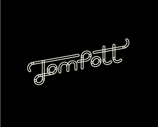
Slitage
by mabu • Uploaded: Apr. 30 '10

Float
(Floaters:
15 )
Description:
Bespoke logotype for Slitage. Supplier of rustic, rough and classical furnitures.
As seen on:
mabu.dk
Status:
Work in progress
Viewed:
2798
Share:


Lets Discuss
I really like this one mads!
ReplySmukt :)*I read Slitage, but it almost looks like Slitoge..*Maybe the kerning could need some more love? :)
Replyhmmmm...great looking typo but it does not say %22rustic, rough and classical%22. To me it says modern, sleek and slightly retro.
Reply@logoboom: I totally agree. The client actually requested this kind of neon-sign-inspired type. I should've put that into the description.**@bilebo: Good call. That's my only concern, so far.**Thanks for the love and feedback gents.
ReplyLook like a pleasant type to me Mads, I've read it correctly without seeing the name.
ReplyLooks* dammit.
ReplyPlease login/signup to make a comment, registration is easy