macromedia
by krinimal • Uploaded: Apr. 23 '10

Float
(Floaters:
1 )
Description:
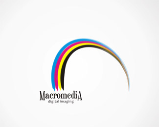
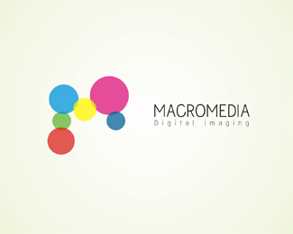
for a leading digital printer! please tell me which one you like the best!
do u see the MM in this one?
Status:
Unused proposal
Viewed:
1198
Share:


Lets Discuss
i like the concept of the double M's, but it's not obvious enough here. try drawing out the M's and then knock out the droplet shape after you have the M's set. **two other picky comments: i don't think the highlights are needed on the droplets %26 try a different font for the %22digital imaging%22. that type works well large, but quickly becomes hard to read.**oh, another idea just popped into my head: the shapes of the bowls in the letters (especially in the a) form pretty good droplet shapes. would be a nice repetition of shape.
Replybeen thinking of converting the a's and e's myself in fact :)*Thanks sinisterdesign! Am working out on a few more logos on this theme... will post soon :)
ReplyPlease login/signup to make a comment, registration is easy