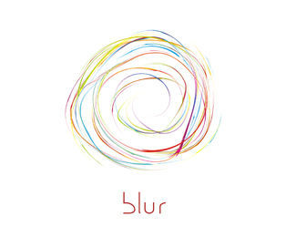
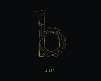
blur
by krinimal • Uploaded: Apr. 17 '10

Float
(Floaters:
1 )
Description:
Started with a clothing brand in mind... now, i feel it might also be good for a cafe/pub! please give in your ideas and suggestions for improvement..
Status:
Unused proposal
Viewed:
1747
Share:


Lets Discuss
Really like it on the dark background. The 'b' in blur looks odd to me.
ReplySwirly-bundle-of-wire cliche, sorry.
ReplyNicely executed though
ReplyI feel like this is a pretty common idea now.. I'd prob use a different typeface though... or fix that %22b%22..
ReplyThanks guys... will rework and post soon!
ReplyVery nice, very! On white bg are lost lines check my logo igre how we made to work on white bg.
Replydannygdammit, i fixed that b and worked on a 'b' instead of a bundle... please see the updated version at http://logopond.com/gallery/detail/101868 and tell me what u think!
ReplyPlease login/signup to make a comment, registration is easy