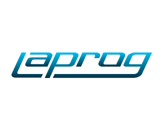
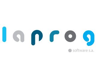
Digital Brand
by koriman • Uploaded: Mar. 19 '08

Float
(Floaters:
0 )
Description:
This is the logo of my company...
Status:
Nothing set
Viewed:
1471
Share:


Lets Discuss
I like the gray and orange but I gotta be honest with you. The connected circles are too generic. So many people use it in designs because they feel like they need to have a shape in a logo. I would advise for you to come up with a more original symbol less used. Very clean looking though.
ReplyThanks vikin, I noticed it since the begining, but my partners vote for this one. I think you're completely right and I'd preffer another symbol that represents better our work. I really appreciate your suggestion and I'll try to find another way for this logo. Thanks!
ReplyPlease login/signup to make a comment, registration is easy