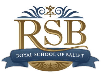
Royal School of Ballet
by jwadenpfuhl • Uploaded: Jul. 27 '07

Description:
Logo design concept for classical ballet school
Status:
Nothing set
Viewed:
3654
Share:




Lets Discuss
to be honest i kinda think your maybe missing the point here.. or maybe i am.. but when i think ballet i think grace %26 balance %26 although your obviously talented you've not grasped these vital elements... if i could make a suggestion.. %26 its only that.. i may be wrong.. but forget the gradients.. have the logo reversed out... have the 'shoe/foot' above RSB %26 not so big.. centralized... keep RSB a serif font but i would suggest lose the ribbon... but if you really want the ribbon applied somewhere, then maybe have it tailing off the top of the boot straps... almost into an abstract leg?... im suggesting something theatrical kinda (you know.. as though the lights out %26 the audience focus is on the feet of this amazing ballerina... RSB the stage) . or am i suggesting too much... anyway.. all the best mate :)
ReplyNIDO - thanks for the comment/critique...**I'm trying to stay away from the stage/performance idea for this project. My clients feels that too many dance studios are focused on performance instead of solid foundational training that enables you to perform well.**I'll think about the critique and see what I can come up with...
ReplyPlease login/signup to make a comment, registration is easy