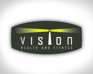
Vision health and fitness
by jrt1223 • Uploaded: Aug. 23 '07

Float
(Floaters:
1 )
Description:
Logo for a new gym. It;s suppose to be a new way of working out for the whole family. The path equals = forward thinking, vision, leading the way
Status:
Nothing set
Viewed:
1213
Share:

Lets Discuss
I really like the graphic treatment, the typography is great, the color selection is unique and appealing. But I don't get the sense that this is for a health club. Maybe it's just me. It strikes me as something appropriate for transportation or industry. Otherwise, it's graphically striking and well created.
Replyjrt - I have to agree with ghorsman about the transportation look and feel. I think the %22S%22 is what's doing that. Your lighthouse logos were more in line, although, I think the name %22VISION%22 is an odd choice in general for a health club. So it's definitely a challenge coming up with a suitable icon.
ReplyThanks guys. It is a bit of an odd job. It would be nice if I could change the name. But hey it's yet another design challenge. It's probably not gonna end up looking like a gym logo. Because the more I learn about it the more it's less a gym and more a family learning and activity center, that's focused on a healthy lifestyle.
ReplyPlease login/signup to make a comment, registration is easy