Calvary Church
by imsoper • Uploaded: Oct. 10 '08

Float
(Floaters:
2 )
Description:
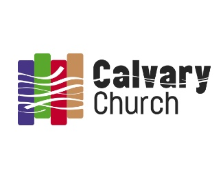
Created for a church with a progressive vision. The graphic is a tapestry, the wavy lines are meant to display the intertwining and interconnectedness of our lives and as well as with God. The 4 colors represent the 4 purposes of the church.
As seen on:
Calvary Church
Status:
Nothing set
Viewed:
936
Share:


Lets Discuss
I like it, especially the detail where the lines enter the tapestry and is curved. The curve through the text is great to tie it together so that the text can be used independently of the graphic. Two small areas in the text that may need tweaking are where the wave intersects the C and the A. The C looks like the upper portion may be filled in on the in side of the curve, it looks top heavy. Where the wave intersects the first A looks a little inconsistent with where it intersects the second A. The second one looks balanced where it intersects along the bottom of the horizontal, maybe the first A could intersect at the top of the horizontal? This might also allow you to open up the inner curve of the C's top half.**I really like the concept also. Different than what most people might default to for a church named Calvary.**This would make an excellent installation and would be easy to reproduce in large scale in a foyer as an interior design element.
ReplyPlease login/signup to make a comment, registration is easy