Working Company
by ilaniam • Uploaded: Feb. 16 '13

Float
(Floaters:
0 )
Description:
This is for our coworking space's brand identity.
We first decided on the name 'Working Company' because it has three layers of meaning
1. It's company while you work
2. It's a company/organization that is all about (co)working
3. It's like a theater company except in its sense of community, except it for working
A good logo should require no explanation, but here is a bit about the creative process...
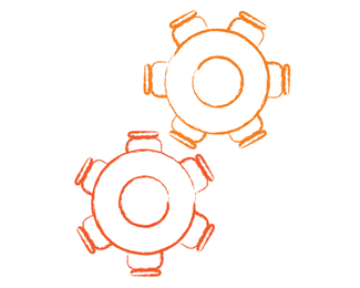
After mind mapping and exploration, I struck upon the concept of two cogs working together. The symbol conveyed collaboration and working, both of which were key aspects of the brand.
The cogs also fit perfectly in the o's of the two words.
I was a little concerned at first about the generic flavor of two simple cogs, then I stumbled upon the symbol of two round tables and chairs while sketching alternative cogs. I tried adding people around the table, but it wasn't possible to keep the association with cogs with heads around the table.
Thoughts? :)
As seen on:
Working Company's Facebook Page
Status:
Work in progress
Viewed:
781
Tags:
warm colors
•
round table
•
cog wheels
•
office space
Share:
Lets Discuss
Please login/signup to make a comment, registration is easy