Metro Family Fitness
by hawkdesign • Uploaded: Nov. 07 '11

Float
(Floaters:
2 )
Description:
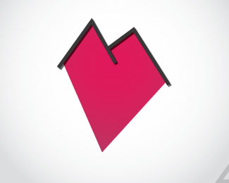
This client has multiple clubs located in Michigan. The concept for this logo came from the idea of doing a skyline cityscape. However, once I spent some time sketching I realized that I could create an "M" out of what looks like skyscraper windows. I believe that the concept is strong and even if the "M" is not seen, once you do see it, you will not forget it.
As seen on:
MetroFamilyFitness.com
Status:
Client work
Viewed:
3411
Tags:
metropolitan
•
metro
•
Michigan
•
city
Share:

Lets Discuss
Please login/signup to make a comment, registration is easy