CRD
by dado • Uploaded: Mar. 30 '10 - Gallerized: Mar. '10

Float
(Floaters:
86 )
Description:
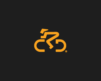
Logo for a Bicycle Group. Based on the initials of the name.
Status:
Client work
Viewed:
23451
Share:


Lets Discuss
Nice solution! Very fluid.
ReplyYeah look's great!
Replyyep well done
Replywell played.
Replyvery nice.
Replythank you guys! I appreciated your comments!:D
ReplyWell played indeed.
ReplyMark is awesome! Type needs some work, but cool nonetheless.
ReplyNice concept. I like it!
ReplyVery nice. I didn't see the R at first, but I definitely like it.
ReplyVery nice. The head/helmet seems it could use a bit of work. Love it.
Replyexcellent logo! looks great!
Replynice isotype, feels very olympic :D **I did read it first as CPD though.
ReplyI should say: I initially read it as CPD, but you've kept the cyclist's body shape natural %3Ci%3Eand%3C/i%3E made an R at the same time so nice one!
ReplyLove this great work
Replyvery clean and superb logo!
ReplyGood god. This is an awesome logo!
Replygood thinking. nice execution!
ReplyNicely executed mark. Not so sure of the type though.
ReplyGreat job Damian.
Replynice logo!
ReplyI really like the symbol and the type sits nicely with it too.
ReplyGreat stuf mate,
ReplyGreat one!
Replyreally simple and exact to the criteria . . . very inspiring*
ReplyGreat Mark! This is what I love in logo design!
ReplyI love this... Good job
Replyfantastic job
ReplyPlease login/signup to make a comment, registration is easy