Thinktank
by Alexander • Uploaded: Mar. 25 '10

Float
(Floaters:
13 )
Description:
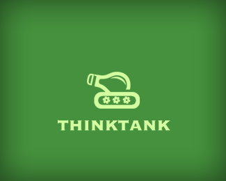
Logo for an upcoming project of mine. It's been about two months since I submitted the original version of this logo. After looking at the critique from everyone here and on other sites, the biggest feedback I received concerned direction and consistency of lines. This updated version faces to the right, and uses more consistent lines throughout. It also has had it's proportions tweaked to be more balanced. Color is still very much 'up in the air'. --- Three images in the mark: Light bulb, tank, and 'LD' (the bulb's threading, a nod to Logiq Design, my design studio)--- Thanks in advance for viewing, and any comments / critiques are all appreciated.
Status:
Client work
Viewed:
6603
Share:


Lets Discuss
Still looks good to me.
ReplyI think it looks great.
Replyhaha. clever and simple. looks good.
ReplyI would question the difference between the line widths (between the body of the bulb and the stem). I'm also not sure why the body doesn't fully connect with the track on the left hand side.**But having said all that I do really like the idea, good work.
ReplyPlease login/signup to make a comment, registration is easy